
2
May
Trans-Tasman
Boomers, Opals unveil alternate uniforms


NBA stars Dyson Daniels and Josh Giddey wearing the new jerseys. Photo: Basketball Australia
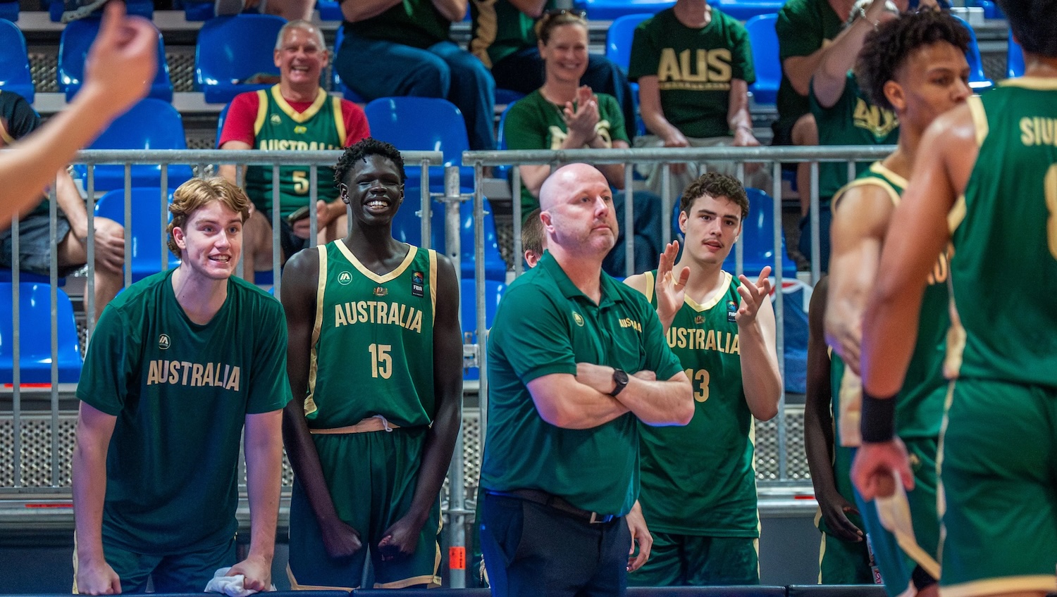
The Boomers and Opals will have a fresh look for the upcoming AUS v NZL Trans-Tasman series.
The Boomers and Opals will have a fresh look for the upcoming AUS v NZL Trans-Tasman Throwdown with alternate jerseys unveiled ahead of the series. The new designs feature the iconic Boomers & Opals titles alongside side panel tapestry designed by Meuram (Darnley / Erub Island) artist Daniel O’Shane.
They say that every name tells a story. And the origins of the Boomers & Opals are no exception.
In the 1970’s, a nameless Austalian men’s team led by coach Lindsay Gaze were forging the foundations of success for the program. Ironically, the now famous Boomers name almost never was, with Gaze recalling in ‘The Boomers’ biography written by Matt Logue that it wasn’t the first choice at the time.
“We were all challenged to come up with names and I was suggesting the dingoes. A combative animal and one who fought for their food. But that didn’t get any support. The kangaroos – but that didn’t get anywhere because the rugby team was called that,” said Gaze.
“I think the Boomers name enhances the promotion and the publicity of the sport, not only in Australia but international as well. It was a collective decision, but the chairman at the time made the call. I don’t know who first came up with it, but it wasn’t my first suggestion.”
Boomers, being a slang term for male kangaroo landed and it’s taken a place in the collective hearts & minds of Australians since.
Likewise, the Opals title arrived in a compelling fashion. Australian basketball Hall of Famer & former Opals Head of Delegation, Lorraine Landon, retells the origins of the iconic title.
“I don’t think this story has ever been told to the Australian public, but at the 1988 Seoul Olympics, an Australian commentator Phil Lynch was calling the women’s team the Bloomers,” said Landon.
“The playing group at the time were not happy about this, partially due to the face it was a take on the men’s team and also because they were wearing bloomers instead of shorts,”
At the time most of the Australia’s men’s teams competing in Olympic Games tournaments had a nickname but the women’s team didn’t, but it was about to change.
In the years following the Bloomers debacle, Tom Maher was appointed Head Coach in 1993 and was adamant that a name for the women’s team was required.

“From the original discussions, there was a criteria; no animal names, a feminine name, distinctly Australian, strong and resilient. Coincidentally, at the time Basketball Australia were negotiating with jeweller Goldmark as the major sponsor,” said Landon.
“That was the start of the Opals, the name was approved by the BA Board and used for the 1994 World Championships held in Australia. The use of an Australian gemstone as a team name was unique and it happened at the same time of the team wearing the bodysuits, which attracted a lot of interest and awareness for the women’s team.”
The artwork featured on the side panel is designed by First Nations artist Daniel O’Shane. An intricate tapestry acknowledges the connection to the land and mirrors the cultural pillars of the Boomers & Opals.
“This print exhibits the values and pillars that we share and strive to uphold as a people, nation and team,” said O’Shane.
“These values are represented by the five reefs that cross through the centre and pertains to our connection to land and strong sense of culture, the importance of family and community, our resilience to push though and get back up, humility and attitude of team over self, the journey and acceptance of hard work with no end and acknowledgment of together we are stronger,” said O’Shane.
“The leaves that create a canopy over these reefs brings all these values together and keeps us accountable to deliver and uphold these standards. The ‘Sik’ (flowering and life of the ocean) are represented by the jagged lines that vibrate from the sides of the reefs which convey the energy emitted from the collective effort when all are in a working motion,”
“Just like a real reef, if there is no life or energy or the conditions are not optimal the reef becomes sterile,” added O’Shane.
“And finally, the ‘Warr’, (patterned wavy linework), that encompasses the design is the intangible flow of our culture and mimics the flow of water. Each line consists of individual and symbolic shapes and patterns depicting totems, animals, landmarks such as the fish traps found in the Eastern Islands of Zenadth Kes, decorative motifs and sound.”
The AUS v NZL Trans-Tasman Throwdown gets underway at the Adelaide Entertainment Centre on Wednesday 7 May.

.avif)

.jpg)


.jpg)


.jpg)